Karolina's Bioinformatics Portfolio
View the Project on GitHub akn006-navarro/bimm143_github_redo
Class 08 Mini Project
Karolina Navarro (PID: A19106745)
- Background
- Data Import
- Principal Component Analysis
- Hierarchoal clustering
- Combining methods
- Prediction
Background
In today’s class we will apply the methods and techniques of clustering and PCA to help make sense of a real world breast caner FNA (fine needle aspiration) biopsy data set.
Data Import
We start by importing our data. It is a CSV file so we will use the
read.csv() function.
wisc.df <- read.csv("WisconsinCancer.csv", row.names = 1)
head(wisc.df)
         diagnosis radius_mean texture_mean perimeter_mean area_mean
842302           M       17.99        10.38         122.80    1001.0
842517           M       20.57        17.77         132.90    1326.0
84300903         M       19.69        21.25         130.00    1203.0
84348301         M       11.42        20.38          77.58     386.1
84358402         M       20.29        14.34         135.10    1297.0
843786           M       12.45        15.70          82.57     477.1
         smoothness_mean compactness_mean concavity_mean concave.points_mean
842302           0.11840          0.27760         0.3001             0.14710
842517           0.08474          0.07864         0.0869             0.07017
84300903         0.10960          0.15990         0.1974             0.12790
84348301         0.14250          0.28390         0.2414             0.10520
84358402         0.10030          0.13280         0.1980             0.10430
843786           0.12780          0.17000         0.1578             0.08089
         symmetry_mean fractal_dimension_mean radius_se texture_se perimeter_se
842302          0.2419                0.07871    1.0950     0.9053        8.589
842517          0.1812                0.05667    0.5435     0.7339        3.398
84300903        0.2069                0.05999    0.7456     0.7869        4.585
84348301        0.2597                0.09744    0.4956     1.1560        3.445
84358402        0.1809                0.05883    0.7572     0.7813        5.438
843786          0.2087                0.07613    0.3345     0.8902        2.217
         area_se smoothness_se compactness_se concavity_se concave.points_se
842302    153.40      0.006399        0.04904      0.05373           0.01587
842517     74.08      0.005225        0.01308      0.01860           0.01340
84300903   94.03      0.006150        0.04006      0.03832           0.02058
84348301   27.23      0.009110        0.07458      0.05661           0.01867
84358402   94.44      0.011490        0.02461      0.05688           0.01885
843786     27.19      0.007510        0.03345      0.03672           0.01137
         symmetry_se fractal_dimension_se radius_worst texture_worst
842302       0.03003             0.006193        25.38         17.33
842517       0.01389             0.003532        24.99         23.41
84300903     0.02250             0.004571        23.57         25.53
84348301     0.05963             0.009208        14.91         26.50
84358402     0.01756             0.005115        22.54         16.67
843786       0.02165             0.005082        15.47         23.75
         perimeter_worst area_worst smoothness_worst compactness_worst
842302            184.60     2019.0           0.1622            0.6656
842517            158.80     1956.0           0.1238            0.1866
84300903          152.50     1709.0           0.1444            0.4245
84348301           98.87      567.7           0.2098            0.8663
84358402          152.20     1575.0           0.1374            0.2050
843786            103.40      741.6           0.1791            0.5249
         concavity_worst concave.points_worst symmetry_worst
842302            0.7119               0.2654         0.4601
842517            0.2416               0.1860         0.2750
84300903          0.4504               0.2430         0.3613
84348301          0.6869               0.2575         0.6638
84358402          0.4000               0.1625         0.2364
843786            0.5355               0.1741         0.3985
         fractal_dimension_worst
842302                   0.11890
842517                   0.08902
84300903                 0.08758
84348301                 0.17300
84358402                 0.07678
843786                   0.12440
Make sure to remove the first diagnosis column - I don’t want to use
this for my machine learning models. We will use it later to compare our
results to the expert diagnosis.
wisc.data <- wisc.df[,-1]
diagnosis <- wisc.df$diagnosis
Q1. How many observations are in this dataset?
nrow(wisc.df)
[1] 569
Q2. How many of the observations have a malignant diagnosis?
sum(wisc.df$diagnosis == "M")
[1] 212
Or you can use the table() function
table(wisc.df$diagnosis)
  B   M
357 212
Q3. How many variables/features in the data are suffixed with _mean?
colnames(wisc.df)
 [1] "diagnosis"               "radius_mean"
 [3] "texture_mean"            "perimeter_mean"
 [5] "area_mean"               "smoothness_mean"
 [7] "compactness_mean"        "concavity_mean"
 [9] "concave.points_mean"     "symmetry_mean"
[11] "fractal_dimension_mean"  "radius_se"
[13] "texture_se"              "perimeter_se"
[15] "area_se"                 "smoothness_se"
[17] "compactness_se"          "concavity_se"
[19] "concave.points_se"       "symmetry_se"
[21] "fractal_dimension_se"    "radius_worst"
[23] "texture_worst"           "perimeter_worst"
[25] "area_worst"              "smoothness_worst"
[27] "compactness_worst"       "concavity_worst"
[29] "concave.points_worst"    "symmetry_worst"
[31] "fractal_dimension_worst"
length(grep("_mean", colnames(wisc.df)))
[1] 10
Principal Component Analysis
The main function here is pcomp() and we want to make sure we set the
optional argument scale=TRUE:
wisc.pr <- prcomp(wisc.data, scale=TRUE)
summary(wisc.pr)
Importance of components:
                          PC1    PC2     PC3     PC4     PC5     PC6     PC7
Standard deviation     3.6444 2.3857 1.67867 1.40735 1.28403 1.09880 0.82172
Proportion of Variance 0.4427 0.1897 0.09393 0.06602 0.05496 0.04025 0.02251
Cumulative Proportion  0.4427 0.6324 0.72636 0.79239 0.84734 0.88759 0.91010
                           PC8    PC9    PC10   PC11    PC12    PC13    PC14
Standard deviation     0.69037 0.6457 0.59219 0.5421 0.51104 0.49128 0.39624
Proportion of Variance 0.01589 0.0139 0.01169 0.0098 0.00871 0.00805 0.00523
Cumulative Proportion  0.92598 0.9399 0.95157 0.9614 0.97007 0.97812 0.98335
                          PC15    PC16    PC17    PC18    PC19    PC20   PC21
Standard deviation     0.30681 0.28260 0.24372 0.22939 0.22244 0.17652 0.1731
Proportion of Variance 0.00314 0.00266 0.00198 0.00175 0.00165 0.00104 0.0010
Cumulative Proportion  0.98649 0.98915 0.99113 0.99288 0.99453 0.99557 0.9966
                          PC22    PC23   PC24    PC25    PC26    PC27    PC28
Standard deviation     0.16565 0.15602 0.1344 0.12442 0.09043 0.08307 0.03987
Proportion of Variance 0.00091 0.00081 0.0006 0.00052 0.00027 0.00023 0.00005
Cumulative Proportion  0.99749 0.99830 0.9989 0.99942 0.99969 0.99992 0.99997
                          PC29    PC30
Standard deviation     0.02736 0.01153
Proportion of Variance 0.00002 0.00000
Cumulative Proportion  1.00000 1.00000
Q4. From your results, what proportion of the original variance is captured by the first principal component (PC1)?
44.27%
Q5. How many principal components (PCs) are required to describe at least 70% of the original variance in the data?
3 PCs
Q6. How many principal components (PCs) are required to describe at least 90% of the original variance in the data?
7 PCs
Q7. What stands out to you about this plot? Is it easy or difficult to understand? Why?
This plot is difficult to understand as it lacks having taken into consideration, the degrees of variance between the data. Therefore, PCA is necessary to incorporate and generate our own plots to make sense of this PCA result.
Our main PCA “score plot” or “PC plot” of results:
library(ggplot2)
ggplot(wisc.pr$x) +
    aes(PC1, PC2, col=diagnosis) +
    geom_point()
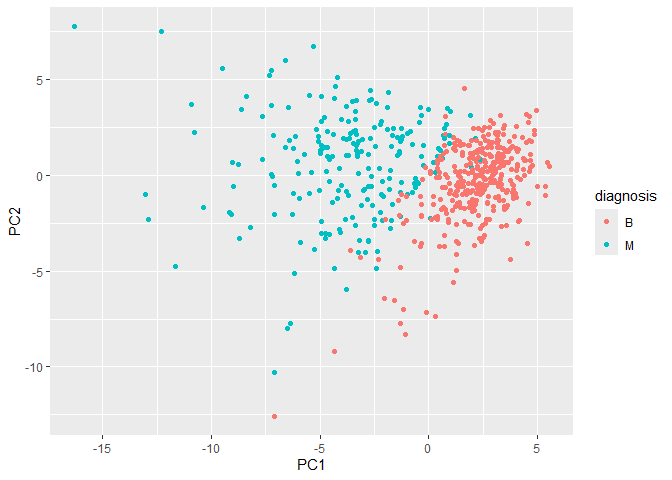
Collectively these two plots (“score plot” and “loadings plot”) tell us that if cells nucle are deeply indented (“concave”), irrgeular and non circular (“compactness”), and have large “perimeter” values they tend to be malignant
Q9. For the first principal component, what is the component of the loading vector (i.e. wisc.pr$rotation[,1]) for the feature concave.points_mean? This tells us how much this original feature contributes to the first PC. Are there any features with larger contributions than this one?
wisc.pr$rotation["concave.points_mean", 1]
[1] -0.2608538
Hierarchoal clustering
First scale the data (with the scale() function), then calculate a
distance matrix (with the dist() function). Then cluster with the
hclust` function and plot:
Q10. Using the plot() and abline() functions, what is the height at which the clustering model has 4 clusters?
wisc.hclust <- hclust(dist(scale(wisc.data)) )
plot(wisc.hclust)
abline(h=20, col="red")
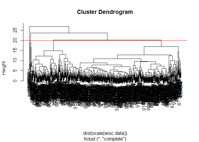
You can use the cutree() function with a argument k=4 rather than
h=height.
wisc.hclust.clusters <- cutree(wisc.hclust, k=4)
table(wisc.hclust.clusters)
wisc.hclust.clusters
  1   2   3   4
177   7 383   2
Combining methods
Here we will take our PCA results and use those as input for clustering.
In other words our wisc.pr$x scores that we plotted above (the main
output from PCA - how the data lie on our new principal component
axis/variables) and use a subset of the PCs that capture the most
variance as input for hclust().
pc.dist <- dist( wisc.pr$x[,1:3] )
wisc.pr.hclust <- hclust(pc.dist, method = "ward.D2")
plot(wisc.pr.hclust)
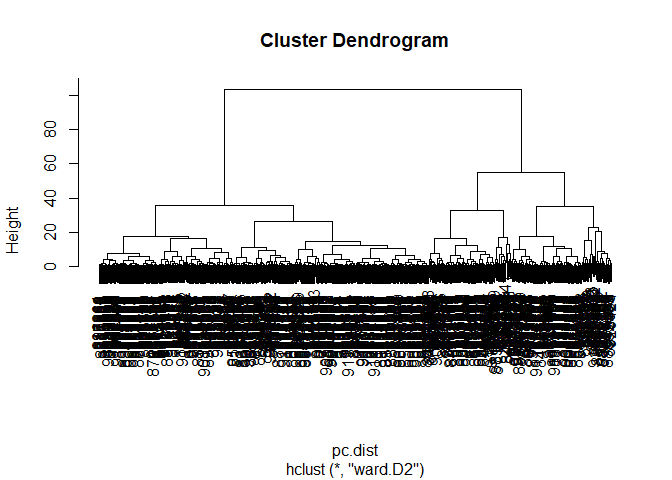
Cut the dendogram/tree into two main groups/clusters:
grps <- cutree(wisc.pr.hclust, k=2)
table(grps)
grps
  1   2
203 366
Q.How well does the newly created hclust model with two clusters separate out the two “M” and “B” diagnoses?
Not extremely well as it only provides the number of variables or population size of each group.
I want to know how clustering into grps with the values of 1 or 2
correspond to the expert diagnosis
table(grps, diagnosis)
    diagnosis
grps   B   M
   1  24 179
   2 333  33
Q. How well do the hierarchical clustering models you created in the previous sections (i.e. without first doing PCA) do in terms of separating the diagnoses?
This method provides a more thorough representation of the patients cells as it is able to decipher between malignant and benign groups in comparison to previosu models used.
My clustering group 1 are mostly “M” diagnosis (179) and my clustering group 2 are mostly “B” diagnosis (333).
24 FP 179 TP 333 TN 33 FN
Sensitivity TP/(TP + FN)
179/(179+33)
[1] 0.8443396
Specificity
333/(333 + 24)
[1] 0.9327731
Prediction
#url <- "new_samples.csv"
url <- "https://tinyurl.com/new-samples-CSV"
new <- read.csv(url)
npc <- predict(wisc.pr, newdata=new)
npc
           PC1       PC2        PC3        PC4       PC5        PC6        PC7
[1,]  2.576616 -3.135913  1.3990492 -0.7631950  2.781648 -0.8150185 -0.3959098
[2,] -4.754928 -3.009033 -0.1660946 -0.6052952 -1.140698 -1.2189945  0.8193031
            PC8       PC9       PC10      PC11      PC12      PC13     PC14
[1,] -0.2307350 0.1029569 -0.9272861 0.3411457  0.375921 0.1610764 1.187882
[2,] -0.3307423 0.5281896 -0.4855301 0.7173233 -1.185917 0.5893856 0.303029
          PC15       PC16        PC17        PC18        PC19       PC20
[1,] 0.3216974 -0.1743616 -0.07875393 -0.11207028 -0.08802955 -0.2495216
[2,] 0.1299153  0.1448061 -0.40509706  0.06565549  0.25591230 -0.4289500
           PC21       PC22       PC23       PC24        PC25         PC26
[1,]  0.1228233 0.09358453 0.08347651  0.1223396  0.02124121  0.078884581
[2,] -0.1224776 0.01732146 0.06316631 -0.2338618 -0.20755948 -0.009833238
             PC27        PC28         PC29         PC30
[1,]  0.220199544 -0.02946023 -0.015620933  0.005269029
[2,] -0.001134152  0.09638361  0.002795349 -0.019015820
plot(wisc.pr$x[,1:2], col=grps)
points(npc[,1], npc[,2], col="blue", pch=16, cex=3)
text(npc[,1], npc[,2], c(1,2), col="white")
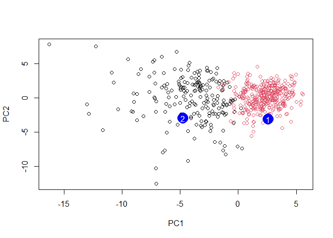
Q. Which of these new patients should we prioritize for follow up based on your results?
Patient grouped in PC1 should be prioritized for follow up based on the results which infer abnormal cell activity at the clustering site (between 0-5).